-

FASHION PLAYER × KENJI SASAOKA “BEETHOVEN REBORN” tee
¥5,500($34.71)
FASHION PLAYER × KENJI SASAOKA “BEETHOVEN REBORN” TEE 漫画家・佐々岡健次氏とのコラボレーションによるショートスリーブTシャツ。 水木しげる氏のもとで学んだ佐々岡氏による描き下ろしグラフィックを、フロントに大きくプリントしています。 ベートーヴェンをモチーフに、妖怪的な造形と力強い線で再構築した「BEETHOVEN REBORN」。クラシックな肖像のイメージを、佐々岡氏ならではの漫画表現でFASHION PLAYERの世界観に落とし込んだ一枚です。 ボディにはGILDANのヘビーウェイトTシャツを使用。程よく厚みのあるコットンボディで、1枚でも着用しやすいベーシックなシルエットです。 綿 100% 【サイズ】 S:着丈 70.5cm / 身幅 46.5cm / 袖丈 17cm M:着丈 72cm / 身幅 51.5cm / 袖丈 17.5cm L:着丈 75.5cm / 身幅 55.5cm / 袖丈 19cm XL:着丈 79.5cm / 身幅 60.5cm / 袖丈 20cm ※サイズには若干の個体差があります。 ※プリント範囲、色味には個体差があります。
-
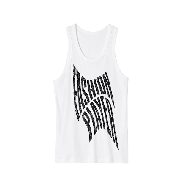
FASHION PLAYER Distortion Logo Tank Top
¥4,400($27.77)
FASHION PLAYER Distortion Logo Tank Top フロントにFASHION PLAYERのグラフィックを大きくプリントしたタンクトップ。 「FASHION PLAYER」のタイポグラフィを波打つように変形し、ヴィンテージプリントを思わせる擦れた質感で仕上げたグラフィックをフロントに配置しています。 リブ感のあるボディで、1枚での着用はもちろん、シャツやジャケットのインナーとしても使いやすいアイテムです。 綿 100% 【サイズ目安】 XS:チェスト 76–84cm / ウエスト 64–72cm / ヒップ 82–88cm S:チェスト 80–88cm / ウエスト 68–76cm / ヒップ 86–92cm M:チェスト 88–96cm / ウエスト 76–84cm / ヒップ 92–98cm L:チェスト 96–104cm / ウエスト 84–92cm / ヒップ 98–104cm XL:チェスト 104–112cm / ウエスト 92–100cm / ヒップ 104–110cm XXL:チェスト 112–120cm / ウエスト 100–108cm / ヒップ 110–116cm ※上記サイズは身体寸法の目安です。 ※サイズには若干の個体差があります。 ※プリント範囲、色味には個体差があります。
-

FASHION PLAYER Distortion Logo Tee
¥6,600($41.65)
FASHION PLAYER Distortion Logo Tee フロントにFASHION PLAYERのグラフィックを大きくプリントしたショートスリーブTシャツ。 「FASHION PLAYER」のタイポグラフィを波打つように変形し、ヴィンテージプリントを思わせる擦れた質感で仕上げたグラフィックをフロントに配置しています。 ボディにはGILDANのヘビーウェイトTシャツを使用。程よく厚みのあるコットンボディで、1枚でも着用しやすいベーシックなシルエットです。 綿 100% 【サイズ】 S:着丈 70.5cm / 身幅 46.5cm / 袖丈 17cm M:着丈 72cm / 身幅 51.5cm / 袖丈 17.5cm L:着丈 75.5cm / 身幅 55.5cm / 袖丈 19cm XL:着丈 79.5cm / 身幅 60.5cm / 袖丈 20cm ※サイズには若干の個体差があります。 ※プリント範囲、色味には個体差があります。
-

FASHION PLAYER Logo BackPack
¥6,600($41.65)
FASHION PLAYER LOGO BACKPACK フロントにFASHION PLAYERロゴをプリントしたバックパック。 シンプルなボディに、FASHION PLAYERのロゴを大きく配置。軽量で持ち運びやすく、普段使いはもちろん、通勤・通学やイベント、旅行時のサブバッグとしても使いやすいアイテムです。 フロントにはファスナーポケットを備え、小物の収納にも便利。容量は約17Lで、日常使いにちょうど良いサイズ感です。 ナイロン 100% ストラップ:ポリエステル 【サイズ】 縦 45cm × 横 32cm × 底マチ 12cm 容量:約17L ※素材の特性上、熱を加えると縮む場合があります。 ※ポリエステル素材の染色には分散染料を使用しているため、熱加工によりブリードを起こす可能性があります。お取り扱いにはご注意ください。 ※プリント範囲、色味には個体差があります。
-
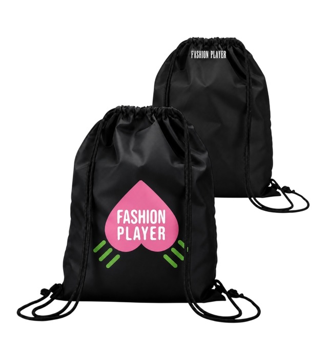
FASHION PLAYER PEACH KNAPSACK
¥3,960($24.99)
フロントにFASHION PLAYERの桃モチーフグラフィックをプリントしたナップサック。 桃のシルエットに「FASHION PLAYER」の文字を配置し、グリーンのラインを組み合わせたグラフィックを大きくプリントしています。裏面上部にはFASHION PLAYERのロゴをワンポイントで配置。 軽量なポリエステル素材を使用した、シンプルな巾着タイプ。約18Lの容量があり、普段使いはもちろん、着替えやシューズなどの持ち運びにも使いやすいサイズです。 ポリエステル 100% 紐:ポリプロピレン 【サイズ】 縦 50cm × 横 40cm 底マチなし 容量:約18L 【COLOR】 BLACK NAVY YELLOW RED BLUE SILVER GRAY ※プリント範囲、色味には個体差があります。 ※素材の特性上、熱により縮みや色移りが発生する場合があります。高温でのお取り扱いにはご注意ください。
-
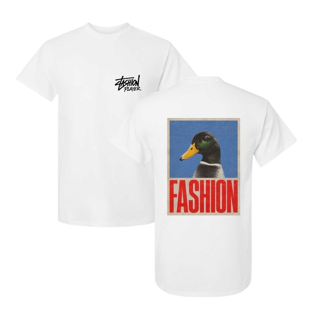
FASHION PLAYER DUCK GRAPHIC TEE
¥6,600($41.65)
フロントとバックにFASHION PLAYERのグラフィックをプリントしたショートスリーブTシャツ。 フロント左胸にはFASHION PLAYERロゴをワンポイントで配置。バックにはマガモのグラフィックと「FASHION」のタイポグラフィを大きくプリントしています。 ボディにはGILDANのヘビーウェイトTシャツを使用。程よく厚みのあるコットンボディで、1枚でも着用しやすいベーシックなシルエットです。 綿 100% 【サイズ】 S:着丈 70.5cm / 身幅 46.5cm / 袖丈 17cm M:着丈 72cm / 身幅 51.5cm / 袖丈 17.5cm L:着丈 75.5cm / 身幅 55.5cm / 袖丈 19cm XL:着丈 79.5cm / 身幅 60.5cm / 袖丈 20cm ※サイズには若干の個体差があります。 ※プリント範囲、色味には個体差があります。
-
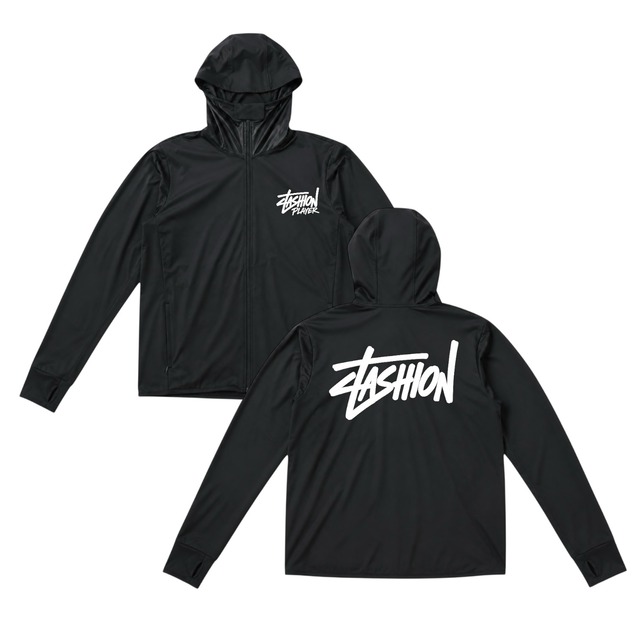
FASHION PLAYER RASH GUARD HOODIE
¥7,700($48.59)
FASHION PLAYER RASH GUARD HOODIE 胸元とバックにFASHION PLAYERのグラフィックをプリントしたフード付きジップアップトップ。 ストレッチ性のある薄手のボディを使用し、タウンユースはもちろん、海やプール、ランニングなどのアクティブシーンにも対応します。 フロントは胸元にワンポイントでFASHION PLAYERロゴを配置。バックには大きくFASHIONグラフィックをプリントしています。 ポリエステル 92.7% スパンデックス 7.3% 【サイズ目安】 M:身長 150–160cm L:身長 160–165cm XL:身長 165–170cm 2XL:身長 170–175cm 3XL:身長 175–180cm 4XL:身長 180–190cm
-
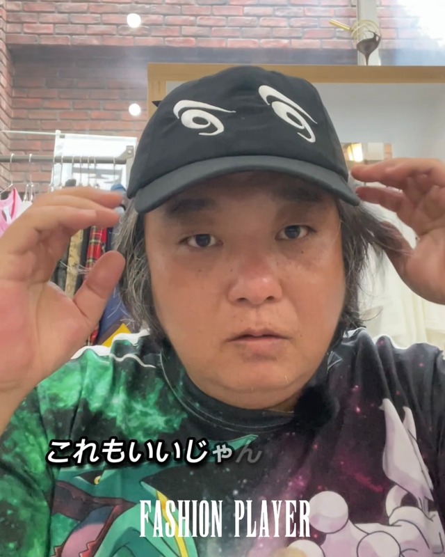
HENO-HENO Embroidered Polyester Cap Black
¥8,800($55.54)
シンプルなシルエットに印象的な刺繍を組み合わせたキャップ。 毎日のスタイリングに取り入れやすい一品です。 【ブランド紹介】 FASHION PLAYERは、福岡に店舗を構えるファッションブランドです。 アート、カルチャー、そしてユーモアを日常に取り入れ、 「All dad jokes turned into fashion.」 をコンセプトに、 日常の何気ない発想や言葉遊びを、身に着けられるデザインへと落とし込んでいます。
-
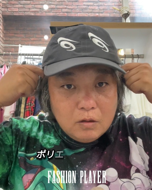
HENO-HENO Embroidered Polyester Cap Gray
¥8,800($55.54)
軽量なポリエステル素材を使用したグレーカラー。 刺繍が程よいアクセントになっています。 【ブランド紹介】 FASHION PLAYERは、福岡に店舗を構えるファッションブランドです。 アート、カルチャー、そしてユーモアを日常に取り入れ、 「All dad jokes turned into fashion.」 をコンセプトに、 日常の何気ない発想や言葉遊びを、身に着けられるデザインへと落とし込んでいます。
-
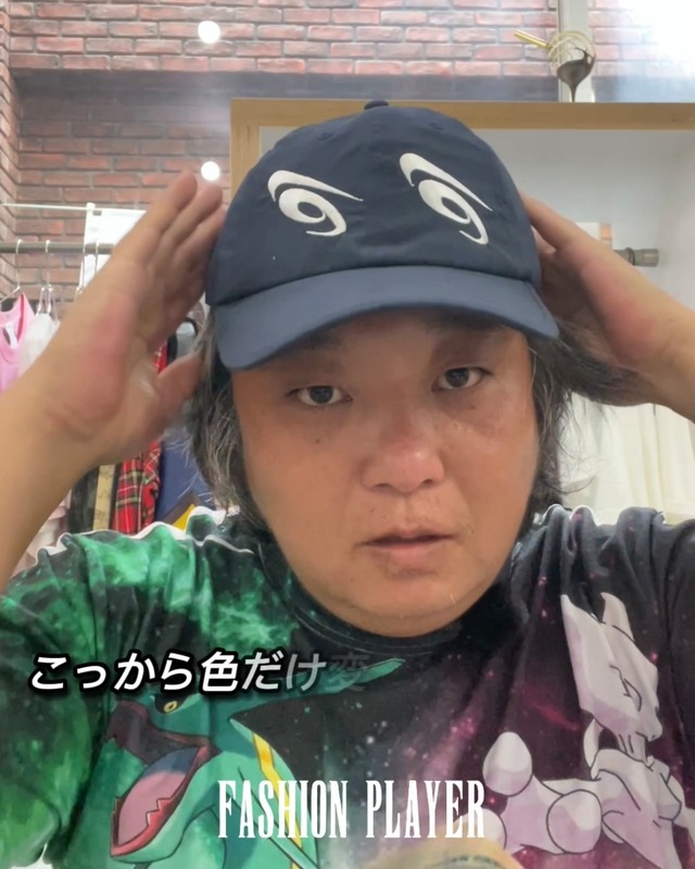
HENO-HENO Embroidered Polyester Cap Navy
¥8,800($55.54)
落ち着いたネイビーカラーにHENO-HENO刺繍を配置。 シンプルながら個性を感じるデザインです。 【ブランド紹介】 FASHION PLAYERは、福岡に店舗を構えるファッションブランドです。 アート、カルチャー、そしてユーモアを日常に取り入れ、 「All dad jokes turned into fashion.」 をコンセプトに、 日常の何気ない発想や言葉遊びを、身に着けられるデザインへと落とし込んでいます。
-
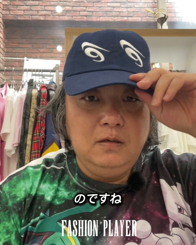
HENO-HENO Embroidered Washed Cotton Cap Navy
¥7,700($48.59)
ウォッシュ加工による柔らかな風合いとネイビーカラーが特徴。 長く愛用できるベーシックなキャップです。 【ブランド紹介】 FASHION PLAYERは、福岡に店舗を構えるファッションブランドです。 アート、カルチャー、そしてユーモアを日常に取り入れ、 「All dad jokes turned into fashion.」 をコンセプトに、 日常の何気ない発想や言葉遊びを、身に着けられるデザインへと落とし込んでいます。
-
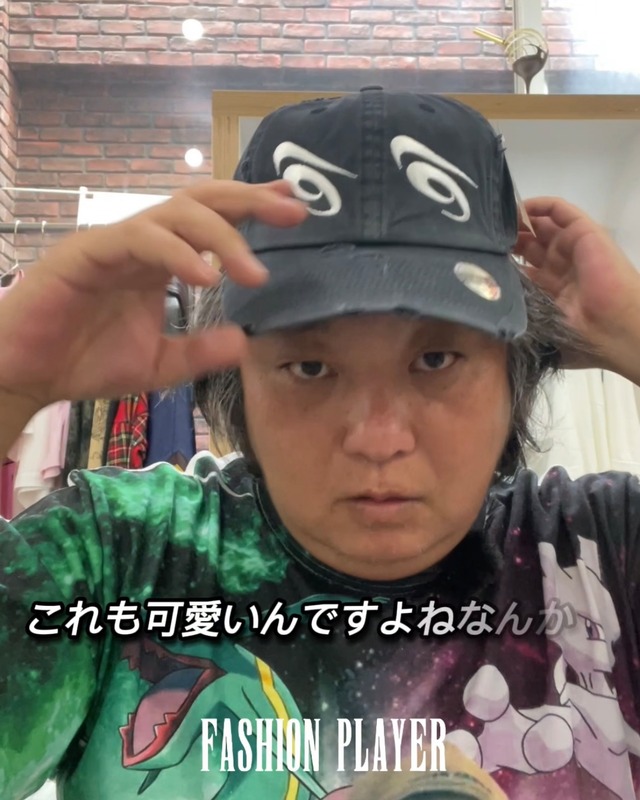
HENO-HENO Embroidered Distressed Cotton Cap Black
¥9,900($62.48)
存在感のあるHENO-HENO刺繍を施したモデル。 ダメージ加工との相性も良く、雰囲気のある仕上がりです。 【ブランド紹介】 FASHION PLAYERは、福岡に店舗を構えるファッションブランドです。 アート、カルチャー、そしてユーモアを日常に取り入れ、 「All dad jokes turned into fashion.」 をコンセプトに、 日常の何気ない発想や言葉遊びを、身に着けられるデザインへと落とし込んでいます。
-
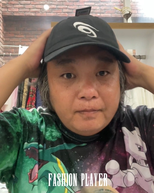
HENO Embroidered Washed Cotton Cap Black
¥7,150($45.12)
ウォッシュ加工を施した柔らかなコットン素材を使用。 HENO刺繍をシンプルに楽しめるキャップです。 【ブランド紹介】 FASHION PLAYERは、福岡に店舗を構えるファッションブランドです。 アート、カルチャー、そしてユーモアを日常に取り入れ、 「All dad jokes turned into fashion.」 をコンセプトに、 日常の何気ない発想や言葉遊びを、身に着けられるデザインへと落とし込んでいます。
-
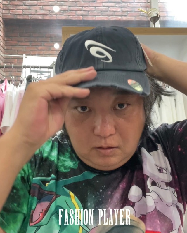
HENO Embroidered Distressed Cotton Cap Black
¥9,350($59.01)
ダメージ加工によるヴィンテージ感が魅力。 使い込むほどに雰囲気が増していきます。 【ブランド紹介】 FASHION PLAYERは、福岡に店舗を構えるファッションブランドです。 アート、カルチャー、そしてユーモアを日常に取り入れ、 「All dad jokes turned into fashion.」 をコンセプトに、 日常の何気ない発想や言葉遊びを、身に着けられるデザインへと落とし込んでいます。
-
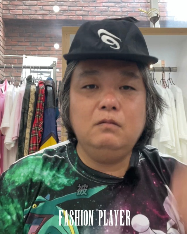
HENO Embroidered Nylon Cap Black
¥8,250($52.06)
軽量なナイロン素材を使用。 普段使いはもちろん、アウトドアや旅行にもおすすめです。 【ブランド紹介】 FASHION PLAYERは、福岡に店舗を構えるファッションブランドです。 アート、カルチャー、そしてユーモアを日常に取り入れ、 「All dad jokes turned into fashion.」 をコンセプトに、 日常の何気ない発想や言葉遊びを、身に着けられるデザインへと落とし込んでいます。
-
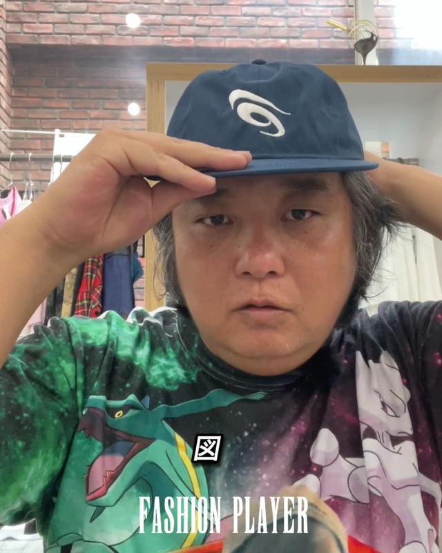
HENO Embroidered Nylon Cap Navy
¥8,250($52.06)
シンプルなデザインと軽さを兼ね備えたナイロンキャップ。 季節を問わず活躍します。 【ブランド紹介】 FASHION PLAYERは、福岡に店舗を構えるファッションブランドです。 アート、カルチャー、そしてユーモアを日常に取り入れ、 「All dad jokes turned into fashion.」 をコンセプトに、 日常の何気ない発想や言葉遊びを、身に着けられるデザインへと落とし込んでいます。
-
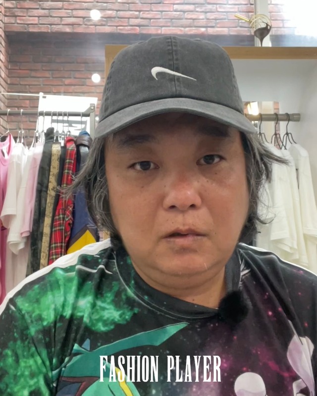
HE Embroidered Polyester Cap Pigment Black
¥7,700($48.59)
SOLD OUT
ピグメント加工による独特な色落ちが魅力。 一点一点異なる風合いを楽しめるキャップです。 【ブランド紹介】 FASHION PLAYERは、福岡に店舗を構えるファッションブランドです。 アート、カルチャー、そしてユーモアを日常に取り入れ、 「All dad jokes turned into fashion.」 をコンセプトに、 日常の何気ない発想や言葉遊びを、身に着けられるデザインへと落とし込んでいます。
-
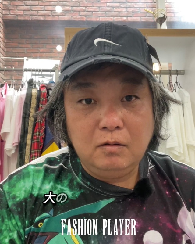
HE Embroidered Distressed Cotton Cap Black
¥8,800($55.54)
シンプルな「HE」の刺繍を施したキャップ。 ダメージ加工を施したコットン素材を使用し、新品でありながら長年使い込んだような風合いが特徴です。 コーディネートに馴染みやすく、季節を問わず着用できます。 【ブランド紹介】 FASHION PLAYERは、福岡に店舗を構えるファッションブランドです。 アート、カルチャー、そしてユーモアを日常に取り入れ、 「All dad jokes turned into fashion.」 をコンセプトに、 日常の何気ない発想や言葉遊びを、身に着けられるデザインへと落とし込んでいます。
-
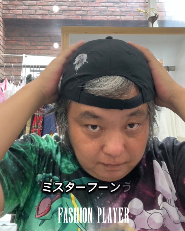
HE / Mr.FUN Print Polyester Cap Black
¥6,600($41.65)
HEとMr.FUNの刺繍を組み合わせたデザイン。 遊び心がありながらも、普段のコーディネートに取り入れやすい一品です。 【ブランド紹介】 FASHION PLAYERは、福岡に店舗を構えるファッションブランドです。 アート、カルチャー、そしてユーモアを日常に取り入れ、 「All dad jokes turned into fashion.」 をコンセプトに、 日常の何気ない発想や言葉遊びを、身に着けられるデザインへと落とし込んでいます。
-
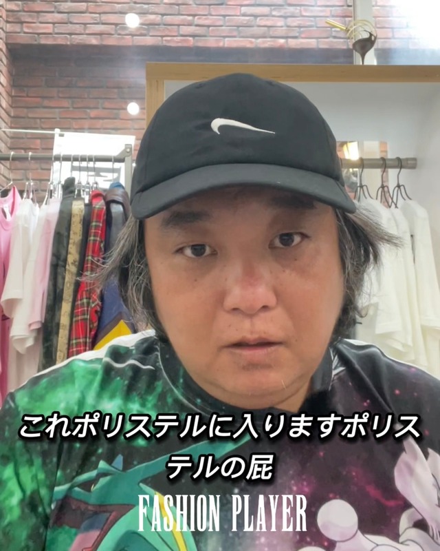
HE Embroidered Polyester Cap Black
¥7,700($48.59)
シンプルな刺繍を主役にしたベーシックなキャップ。 軽量なポリエステル素材を使用し、デイリーに使いやすい仕上がりです。 カジュアルからストリートまで幅広いスタイルに合わせられます。 【ブランド紹介】 FASHION PLAYERは、福岡に店舗を構えるファッションブランドです。 アート、カルチャー、そしてユーモアを日常に取り入れ、 「All dad jokes turned into fashion.」 をコンセプトに、 日常の何気ない発想や言葉遊びを、身に着けられるデザインへと落とし込んでいます。
-
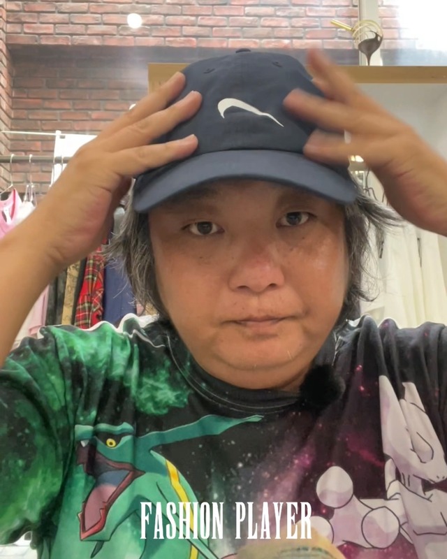
HE Print Polyester Cap Navy
¥6,600($41.65)
シンプルな「HE」のプリントをフロントに施したネイビーカラーのキャップ。 落ち着いた色味で、普段使いしやすいアイテムです。 【ブランド紹介】 FASHION PLAYERは、福岡に店舗を構えるファッションブランドです。 アート、カルチャー、そしてユーモアを日常に取り入れ、 「All dad jokes turned into fashion.」 をコンセプトに、 日常の何気ない発想や言葉遊びを、身に着けられるデザインへと落とし込んでいます。
-
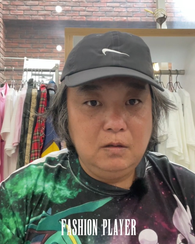
HE Embroidered Polyester Cap Gray
¥7,700($48.59)
グレーカラーのボディにHE刺繍を組み合わせたキャップ。 シンプルなデザインで男女問わず着用できます。 【ブランド紹介】 FASHION PLAYERは、福岡に店舗を構えるファッションブランドです。 アート、カルチャー、そしてユーモアを日常に取り入れ、 「All dad jokes turned into fashion.」 をコンセプトに、 日常の何気ない発想や言葉遊びを、身に着けられるデザインへと落とし込んでいます。
-
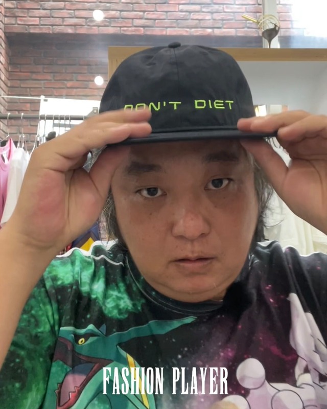
DON'T DIET Embroidered Nylon Cap Black
¥7,700($48.59)
軽量なナイロン素材を使用したキャップ。 アクティブなシーンでも快適に着用できます。 【ブランド紹介】 FASHION PLAYERは、福岡に店舗を構えるファッションブランドです。 アート、カルチャー、そしてユーモアを日常に取り入れ、 「All dad jokes turned into fashion.」 をコンセプトに、 日常の何気ない発想や言葉遊びを、身に着けられるデザインへと落とし込んでいます。
-
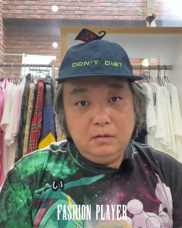
DON'T DIET Embroidered Nylon Cap Navy
¥7,700($48.59)
軽量なナイロン素材とネイビーカラーを組み合わせたキャップ。 普段使いからレジャーまで幅広く活躍します。 【ブランド紹介】 FASHION PLAYERは、福岡に店舗を構えるファッションブランドです。 アート、カルチャー、そしてユーモアを日常に取り入れ、 「All dad jokes turned into fashion.」 をコンセプトに、 日常の何気ない発想や言葉遊びを、身に着けられるデザインへと落とし込んでいます。
We are FASHION PLAYER
実店舗情報
⚫︎住所
810-0023 福岡市中央区警固1-15-50
アークタウン105
⚫︎営業時間
14:00 - 20:00 変則営業あり
開店日 金 土 日 月
定休日 火 水 木
*定休日や営業時間外でも連絡頂ければ、
対応出来る場合もございます



We can negotiate the price, so please contact us from instagram or from the menu: メルカリ, Grailed.
Please note that this product is also available on another website and may be sold out.